


Azure Bloom Luxury Chiffon Hijab
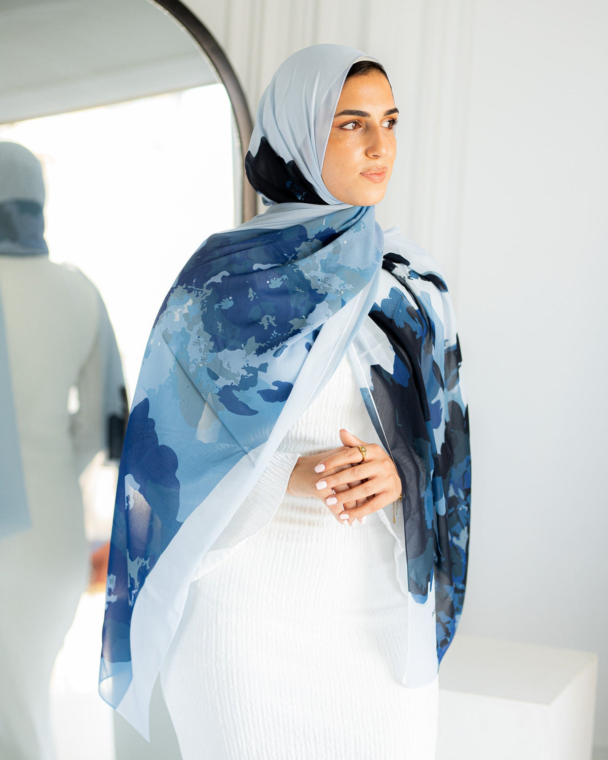
Compare model styling with close imagery to understand print scale and how layering affects the blue.
View product →
Short answer: Hijab colours can look different online because the light, camera, editing, image colour profile, browser and display all affect the final image—and the fabric itself may reflect light differently by angle. Use several product photos, more than one screen, descriptive colour language and your wardrobe undertones rather than expecting an exact screen match.
A colour image travels through a chain before you see it: the real fabric is lit, captured by a camera, processed, saved with a colour profile, displayed by a browser and interpreted by your screen settings. Each step can shift brightness, saturation or undertone. Chiffon, modal cotton and satin add another variable because their surfaces handle light differently.
| Stage | What can change | What a shopper can do |
|---|---|---|
| Lighting | Warm indoor light, cool daylight and shadows alter undertone | Compare images taken in different settings when available |
| Camera | Exposure and white balance affect brightness and warmth | Use several angles instead of one hero image |
| Editing | Contrast and saturation may be adjusted for consistency | Compare the product with nearby neutral objects or skin tones |
| Colour profile | Files and software interpret colour within a defined space | Use a modern browser and avoid screenshots passed through several apps |
| Display | Brightness, night mode and screen calibration vary | Turn off colour-shifting modes and compare on another screen |
| Fabric surface | Matte, sheer and reflective fabrics respond differently to light | Read the fabric description and expect angle-dependent variation |
A taupe hijab may look greyer in cool daylight and warmer under indoor bulbs. Shadows deepen colour, while bright exposure can wash it out. Outdoor photos are not automatically exact either: clouds, nearby walls and reflected greenery can influence the scene.
Look for a set of images rather than selecting from the first thumbnail. If every photo shows the same lighting and angle, uncertainty remains.
Chiffon can look lighter where it is stretched over a bright base and deeper where it is folded. Modal cotton is often more matte, while satin can produce bright highlights and dark folds from the same piece of fabric. A print adds scale and background interactions that a small swatch may not communicate.
Compare model styling with close imagery to understand print scale and how layering affects the blue.
View product →
Use multiple views to compare a soft blush colour across light, shadow and folds.
View product →
A deep neutral example where highlights and shadows can change perceived depth.
View product →High brightness can make dark shades look less deep, while night-shift settings usually warm the display. Some screens are tuned for vivid colour and may exaggerate saturation. Compare the product on a second device if the exact family—cool grey versus warm taupe, for example—will determine whether it works for you.
Industry colour spaces such as sRGB aim to make digital colour more consistent, and colour profiles tell software how to interpret values. They improve consistency but cannot make every uncalibrated display identical to physical fabric.
If you are building an everyday palette, see the neutral hijab capsule guide.
Shop by colour family and contrast. A warm floral can connect to cream, brown or olive even if no shade is exact. A cool blue can sit with navy, charcoal or soft white. Tonal variation often looks more natural than an exact match that is slightly off.
For an event, order with enough time to assess the colour in the actual venue light and with the complete outfit. No responsible online guide can guarantee an exact match across every screen and environment.
Browse JAIDA hijabs and use the checklist before choosing your shade.
Explore all hijabs →Indoor lighting, camera white balance, editing and your display settings can all shift the apparent undertone.
No single image is guaranteed to be exact on every screen. Compare model, close-up and differently lit views, then read the description.
Its reflective surface can create brighter highlights and deeper shadows, making one colour appear to vary by angle.
Compare it with known warm and cool wardrobe colours across several images. Product descriptions can help, but screens still add uncertainty.
An exact match across all cameras, screens and lighting conditions is not realistic. Clear images and descriptions reduce uncertainty but do not remove it.
The JAIDA Team mapped the physical-to-digital colour chain and reviewed public information on sRGB and colour profiles from W3C and Adobe. The guide explains limitations rather than promising exact colour reproduction.
Sources and limits: W3C sRGB information and Adobe colour-profile guidance linked above. Actual fabric colour should be evaluated in person under relevant light.
Use the JAIDA colour guide to compare undertones, contrast and colour families.
Read the skin-tone colour guide →Mehr Styling-Tipps, Stoff-Guides und schlichte Eleganz – ein Beitrag nach dem anderen.
Sweaty or Itchy Scalp Under Hijab: A Gentle Summer Routine
A gentle, non-medical summer routine for scalp comfort under hijab, including drying, laundering, tension and when to seek help.
Weiterlesen
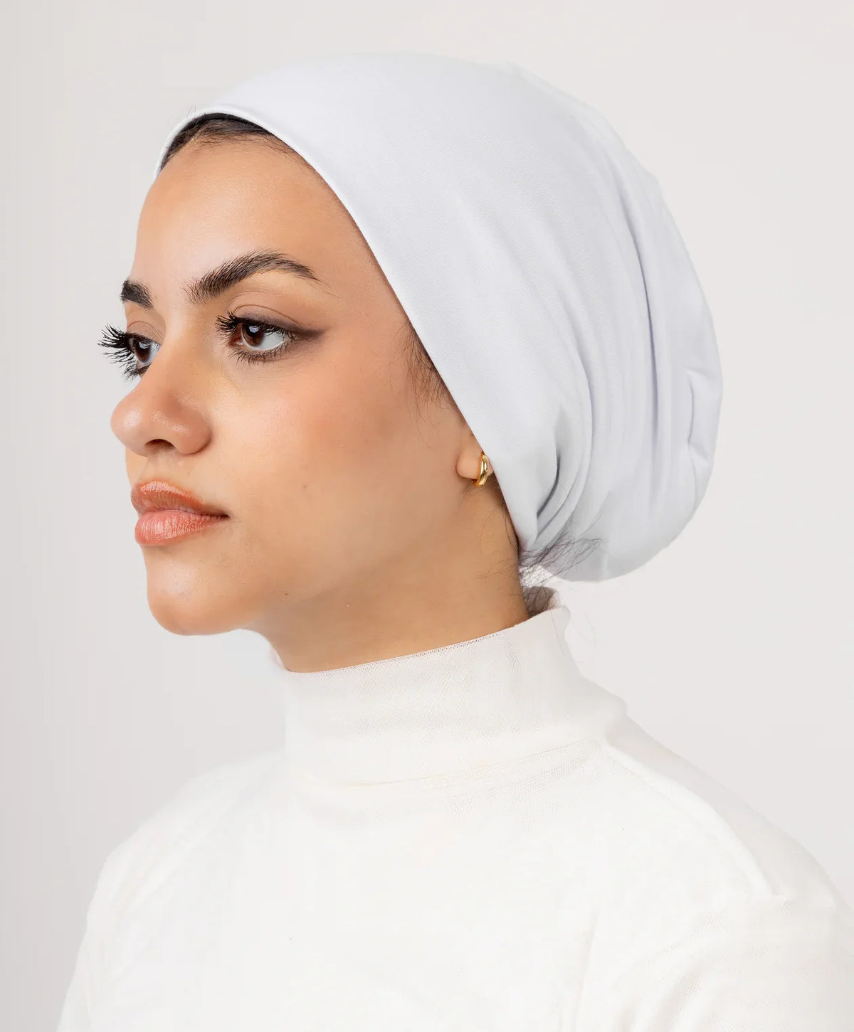
Best Undercap by Hair Type: Fine, Curly, Thick & Protective Styles
Choose an undercap by hair volume, texture, protective style, coverage and comfort instead of a one-size-fits-all label.
Weiterlesen
Hinterlasse einen Kommentar
Diese Website ist durch hCaptcha geschützt und es gelten die allgemeinen Geschäftsbedingungen und Datenschutzbestimmungen von hCaptcha.